Back
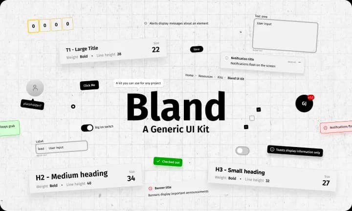
The Bland UI Kit cover. The wordmark “Bland” sits above “A Generic UI Kit” on a grid, ringed by specimens of the kit: title and heading styles labelled with their weight, size and line height, an OTP field, a toggle, a text area, a breadcrumb, badges, an avatar, and toast and notification cards

Bland UI Kit

Bland is a systematized component library built for designing scalable products. It’s open and available for anyone to use.

View UI kit

Background

After years of building reusable components in Figma, I needed a single, well-structured source of truth. I made one previously but there were just too many issues with it.

To fix the issues of the previous one, I audited established design systems like IBM Carbon, Ant Design, Goldman Sachs, and Untitled UI. I used my findings to inform the architecture of Bland.


Key areas of focus

  • Simplicity
  • Token naming conventions
  • Semantic structure
  • File organization
  • Component hierarchy
  • Composability and variant architecture

Some components

For preview only. I’m not actively developing these components.

This is the description section of the Accordion. Write more details here.

A second panel, so the stack has somewhere to push when the first one opens.

A third, which the card is free to clip once anything above it is open.

50
0255075100
1-10 of 100 items
Label
0%
This is loading

Notifications float on the screen

Upload file
Aug.2026

Actively maintained

This is living: what you see is the latest iteration, not the final one. The foundation is solid and continues to evolve.

Additional patterns are in progress and will ship on a weekly cadence. Expect minor refinements to existing components as the system matures.

View UI kit